ZEST
ROLE: Team Lead, Visuals, Interaction, Research
DURATION: Oct - Nov 2018
Concept
Zest is an app that helps users keep track of their spices, herbs and other seasonings, but also serves an informational tool that provides basic information about different spices so users can feel more confident and knowledgeable when cooking.
Novice cooks have a difficult time finding new spices and recipes to try out due to lack of time in their daily schedule, while more experienced cooks have issues keeping track of all the spices they own, and being able to see them all at a given time.
Challenges
Create an easy way for users to discover new spices, as well as recipes that may compliment the spice(s).
Develop an easy-to-understand product interface that allows users to increase their knowledge of spices and herbs.
Establish a digital spice rack for users who enjoy collecting spices, and allow them to view a certain spice at a glance.
Method
LEAN UX
By using the Lean UX process, our team was able to quickly develop possible solutions, test them, and then pivot if necessary without feeling chained to a single idea.This allowed us to move away from heavily documented handoffs so that we could focus on collaboration, iteration, communication and empathy in order to create our solutions.
ASSUMPTIONS
First, we declared our assumptions. This allowed our team to create a common starting point. Each team member had the opportunity to ask specific questions about our audience, problems that we want to solve and how we might solve them.
Next, we fleshed those out into four types:
Business Outcomes - success in terms of the market
Users - who will be using your product (aka personas)
User Outcomes - what will users gain from using your product
Features - how will they achieve a certain outcome
Research
Our team interviewed a sample of four users when conducting research for Zest. These are our findings.
APPS AS ORGANIZATIONAL TOOLS
Using apps to track things in your life is common. 50% of participants said that they use at least one app to stay on top of/organize things in their lives like events, health stats, to do lists etc.
“I use a TV and movie tracker app because I like having the ability to view the things I’ve seen and plan to see easily and at a glance.”
A DEEPER UNDERSTANDING
The database of spices is near endless. However, 75% of participants noted they have a decent understanding of a few spices already, but would like to further their knowledge of them.
“I’m familiar with onion/garlic powder, basil and parsley, but curious to know what else is out there.”
Personas
We sought out to create three distinct personas before venturing out and doing our user research We ended up phasing out one personas and altering these personas further the line to match our user's outcomes. Using Lean UX methods, we were able to do this.
Rachel
Age: 30
Job: Accountant
Family: Single, 1 child
wants to cook more flavorful food
wants to try new spices
doesn’t have time to research
Michael
Age: 47
Job: Professor
Family: Married, no kids
wants to organize spices virtually
view spices at a glance
wants to add app to routine
Hypothesis Statement / Backlog
After we pieced together our assumptions into hypotheses statements, we created a backlog of potential work. Next, we prioritized them according to which statements had the most amount of risk and the least amount of risk so that we could work on them first to either validate it, or pivot to another idea.
SPRINT 2
SPRINT 1
Competition
There are several cooking and recipe apps currently on the market which forced us understand that we would have to create something that would provide fundamentally different experience than what most cooking apps do. Zest would provide users with what a typical recipe app would, but mainly be used as a learning tool that would increase a user’s working knowledge, and as an organizational tool for those who might see value in that.
recipes only
strange or off-putting recipes
overloaded with other content or media
no organizational aspect
not focused on increasing user’s knowledge
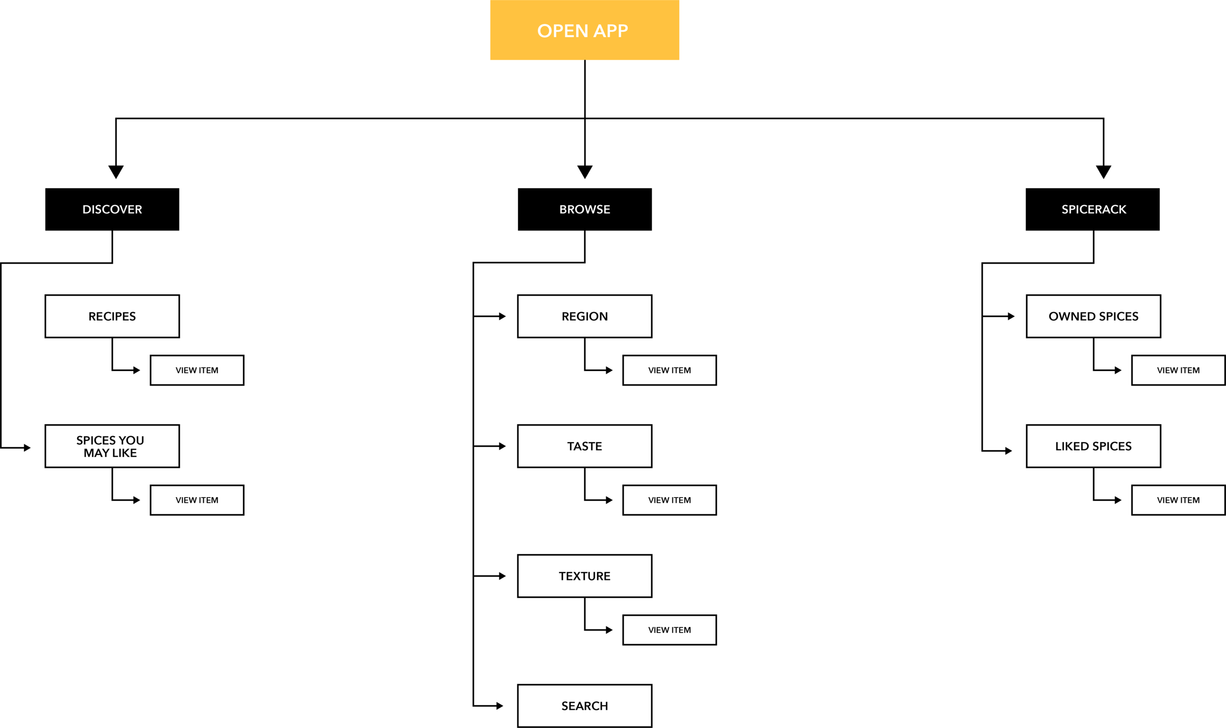
Information Architecture
User Flow

SPRINT 1
Taking our research, information architecture, and use cases, and putting them into form.
Sprint 1 Sketches
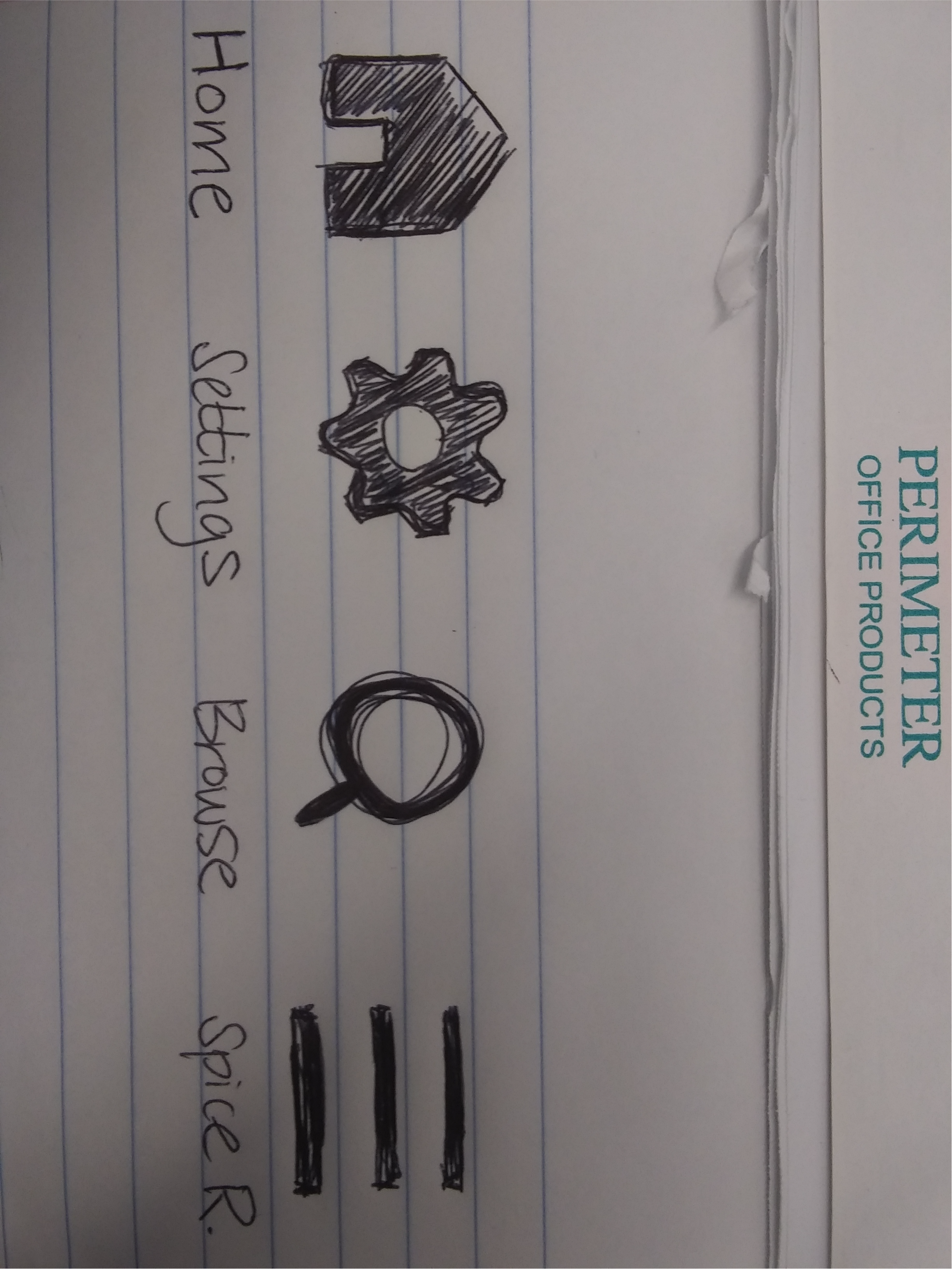
Navigation iconography
Product page / browse / spice rack
Sprint 1 Prototype
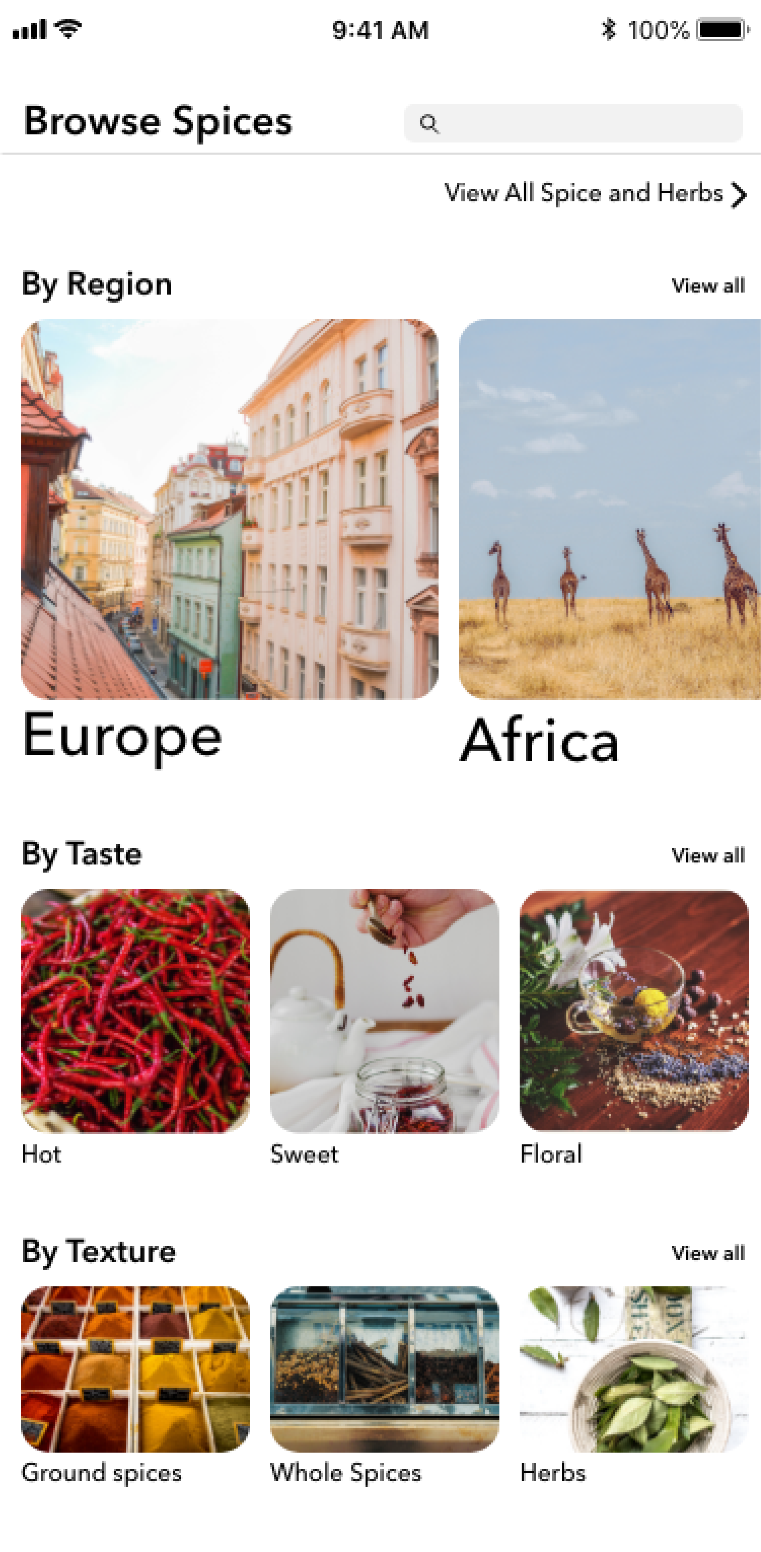
Browse / Search
Browse / Search all
Spice detail
Spicerack
User Testing
Our first round of user testing provided incredibly valuable feedback, and elicited these key points:
POOR ICONOGRAPHY
During our extended user testing, we found that 75% of participants mentioned they had trouble differentiating between icons: what they meant, whether they were selected or disabled, and the connotation attached to each of them.
“The checkmark and bookmark being so close to one another tells me that they do different things, but it's not clear what it is exactly they do differently.”
REDUCING THE PROFILE
Initially, we felt that the addition of a profile feature was a no brainer, but the more we tested and thought on the idea, we came to the conclusion that there isn't much of a need for one.
“I see the profile, but there isn’t much content. It’s as if the profile feature for the sake of having one.”
Sprint 1 Prototype V2
Spice detail V2
Spice detail V2 continued
Spicerack V2

SPRINT 2
Fix current flaws within the app based on user testing and feedback
Implement the outcomes & features we set for the second sprint:
facilitate ways app could be incorporated into a routine for users
Featured Recipes
Favorites
More testing
Sprint 2 Sketches
Discover page
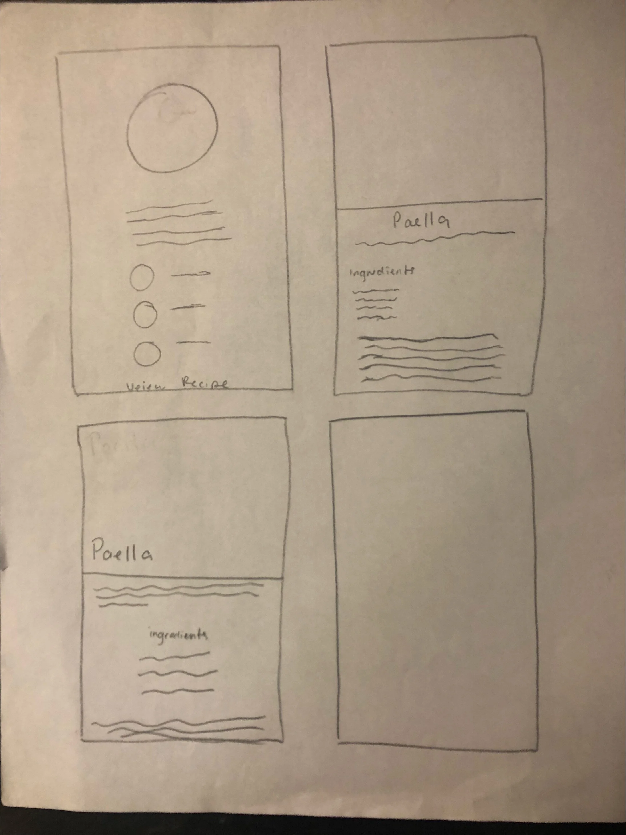
Featured Recipe page
Sprint 2 Prototype
Discover
Discover v2
Featured Recipe
Featured Recipe detail
User Testing
Our second round of user testing continued to provide great feedback, and elicited these key points:
PRODUCT PAGE HIERARCHY
The first impression our product page gave off to 100% of our participants was that the page had an extremely confusing hierarchy. Knowing this, it was a top priority for us to eliminate the pain-points when trying to sift through the information.
“I thought that the 3 sub headings within the product page were actually buttons. I was surprised to find out that they weren’t.”
LACKING KEY RECIPE INFORMATION
50% of our participants claimed to feel they were missing vital information when deciding whether to use on of the recipes featured within the app, including cook time & servings.
“Usually I expect to see something here about prep time or cook time, and it gives me an idea of how many people it will feed.”
Sprint 2 Prototype V2
Spice detail (liked)
Spice detail (saved to spicerack)
Spice detail with featured recipe
Featured Recipe with time & servings
Final Prototype
Colors
Takeaways
This was the first time I have lead a team in terms of design sense or used the Lean UX process, so it was certainly challenging. I greatly appreciated how the Lean UX process heavily reinforces the need for communication between all team members in all parts of the design process, and I strongly feel this breaks down a lot of the hurdles in team based projects and improves them for the better. I will take these experiences learned during this project and gladly apply them in future projects.


